Bahamas First Group

A brand reboot for Bahamas First Group

For the best part of a decade, Bahamas First Insurance, Cayman First Insurance and NUA Insurance Agents & Brokers have been looking after the lives, livelihoods and possessions of their customers in the Bahamas and Cayman Islands. This is the first major rebranding they had, so it really was a big deal for their internal teams, as well as customers.

We began the project with research, when we ran focus groups engaging with employees as well as a variety of other team members representing different levels from each company. We wanted to find out their internal perception of each brand, and employee’s levels of awareness and understanding of the organisation’s vision, mission and values. That insight, combined with external market research, allowed us to identify and define key propositions for each company and to develop a brand strategy.

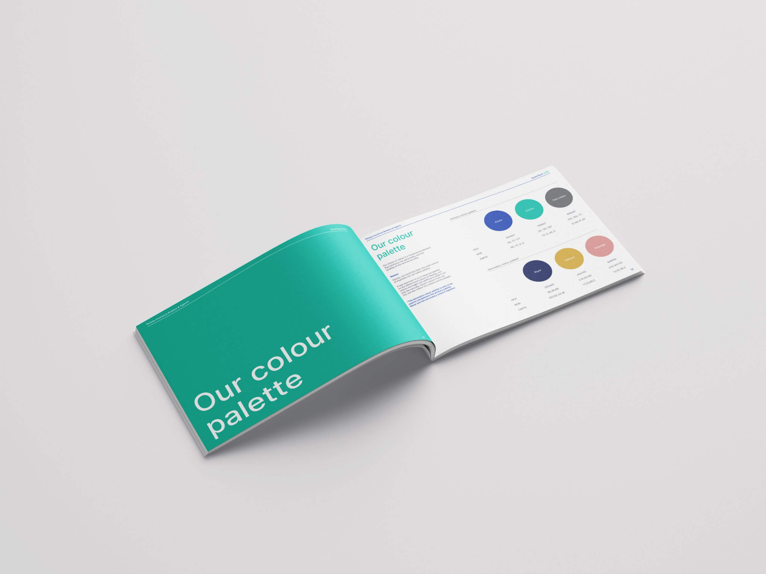
We then moved onto the brand creation stage – reimagining logos, colour palettes, fonts and imagery.

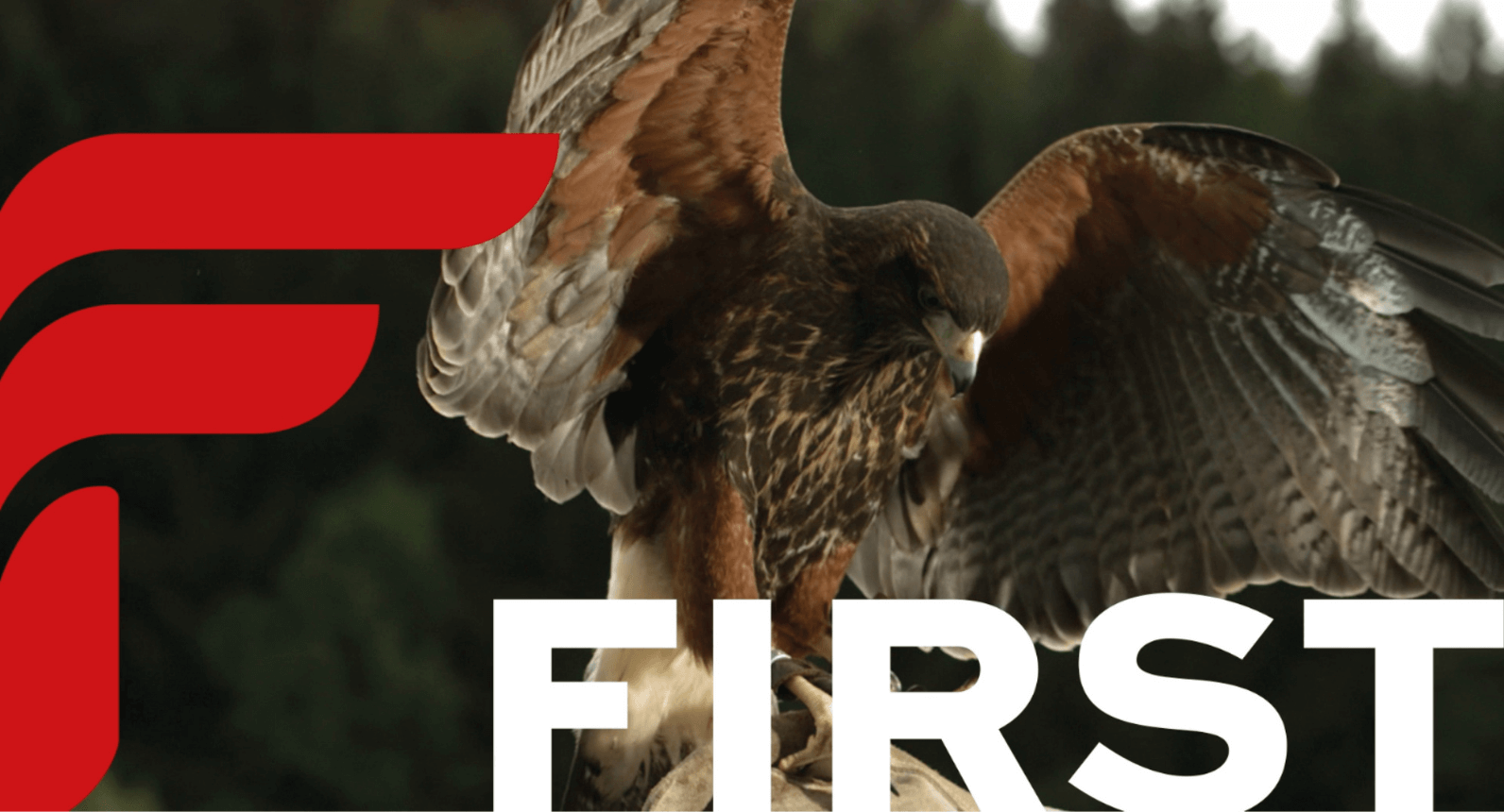
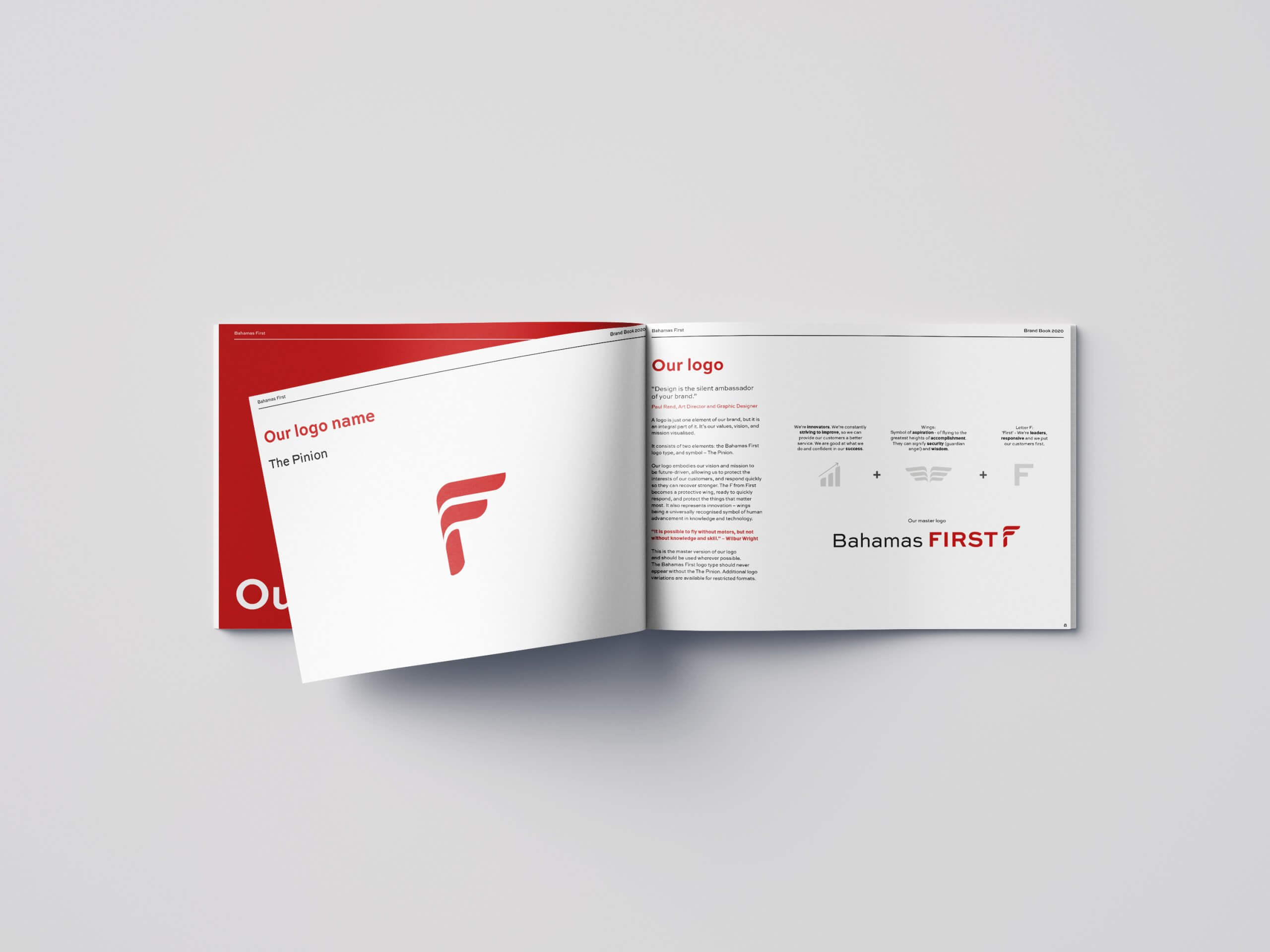
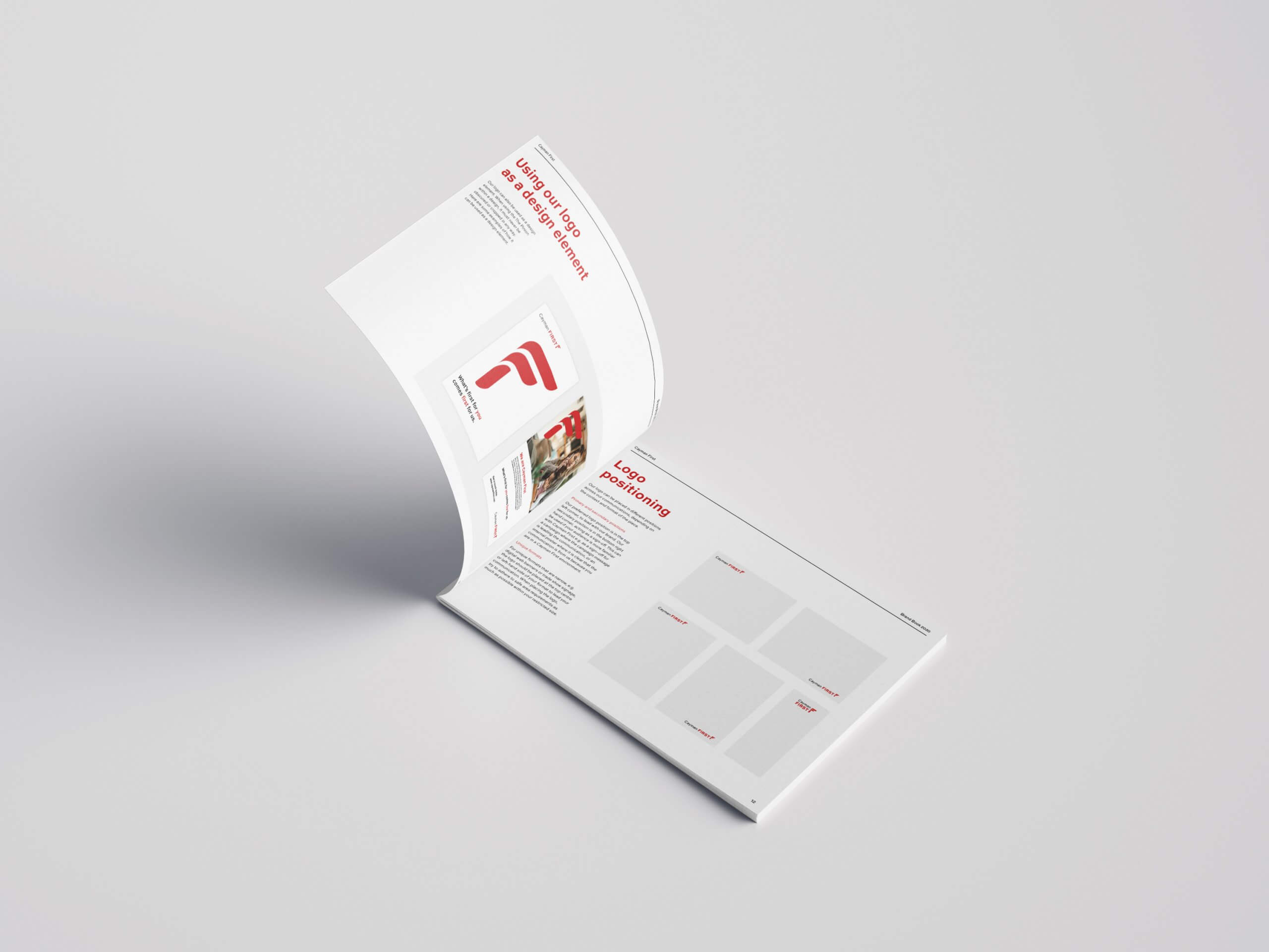
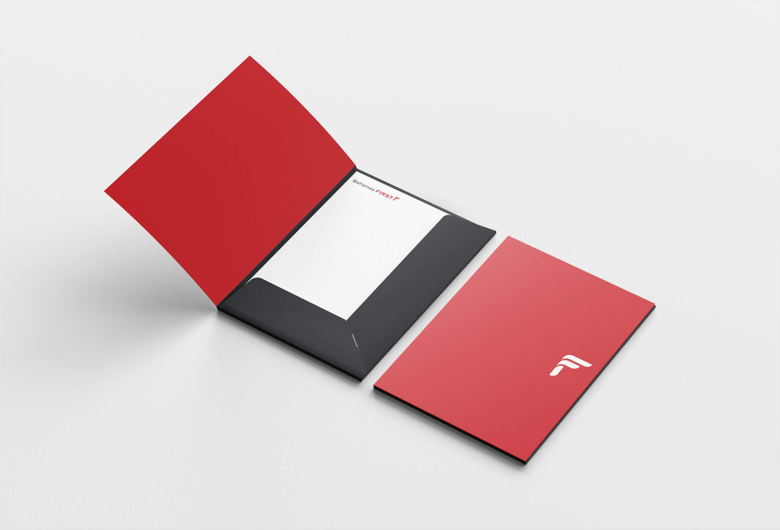
Bahamas First and Cayman First already shared the same branding structure, so this project was an opportunity to further unify their brand style so they could be consistently represented across their respective geographic areas. With a focus on ‘protecting’ their customers against life’s uncertainties, we knew their logo needed to embody this while keeping their nature of being ‘First’ front and centre. We landed on the idea of merging the letter ‘F’ with the wing of a bird – symbolic of protection, but also being fast, and forward-thinking. Thus, ‘The Pinion’ was born.

For NUA, the aim was to refresh a brand that hadn’t been touched for over half a century! For us, it was important to retain some of that heritage, while giving it an update, modernising and energizing their identity. Taking elements of their former logo, inspiration from their geographical and cultural surroundings, and bringing to life their ‘customer service’ driven approach to business, we came up with ‘The United Wave’. The ‘wave’ is made up of three chevrons, with the central one, resembling a heart, being representative of their customers. This is buttressed by two more chevrons that represent the support of NUA’s staff – always being there for their customers. Together they are united against adversity.

One of the most exciting parts of any brand launch is of course, the launch! Before these new brands saw the light of day and were revealed to customers, they were first revealed internally to the employees of each company. With the current global pandemic situation, a full-on launch event attended in person was sadly out of the question – so we wanted to ensure that what was as exciting and impactful as it could possibly be. This animation was the end result, first launching the Bahamas First and Cayman First brands with a bang – before transitioning into NUA’s very own minute of fame.

No brand launch would be complete without some spots on TV, either. Not even a global pandemic and countries in lockdown prevented us from putting together some high-quality commercials to launch the new brands to their customers. On location filming was out of the question, so we instead utilised appropriate stock footage for the 30 second reels – one for Bahamas First, one for Cayman First, and one for NUA.

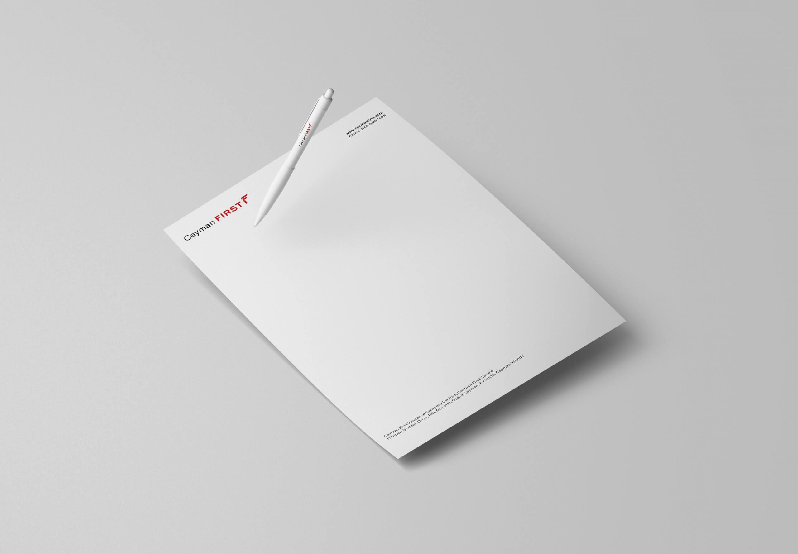
This rebrand project touched so many areas of each company. Not only their online, social and digital presence, but their physical assets, too. From stationary suites and door signage, to car wraps and uniforms, it’s been a lot of fun seeing the brands we created come to life!

See more work
University Hospitals Bristol and Weston
St Monica Trust
Cost of Living